10 Must-Do Steps for an Effective E-commerce Landing Page
A landing page in e-commerce marketing is the page a potential customer lands on before completing the purchase of a product or service. We analyze how to create an effective landing page.
Landing page — what is it?
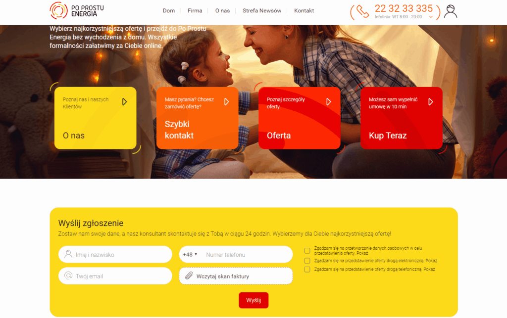
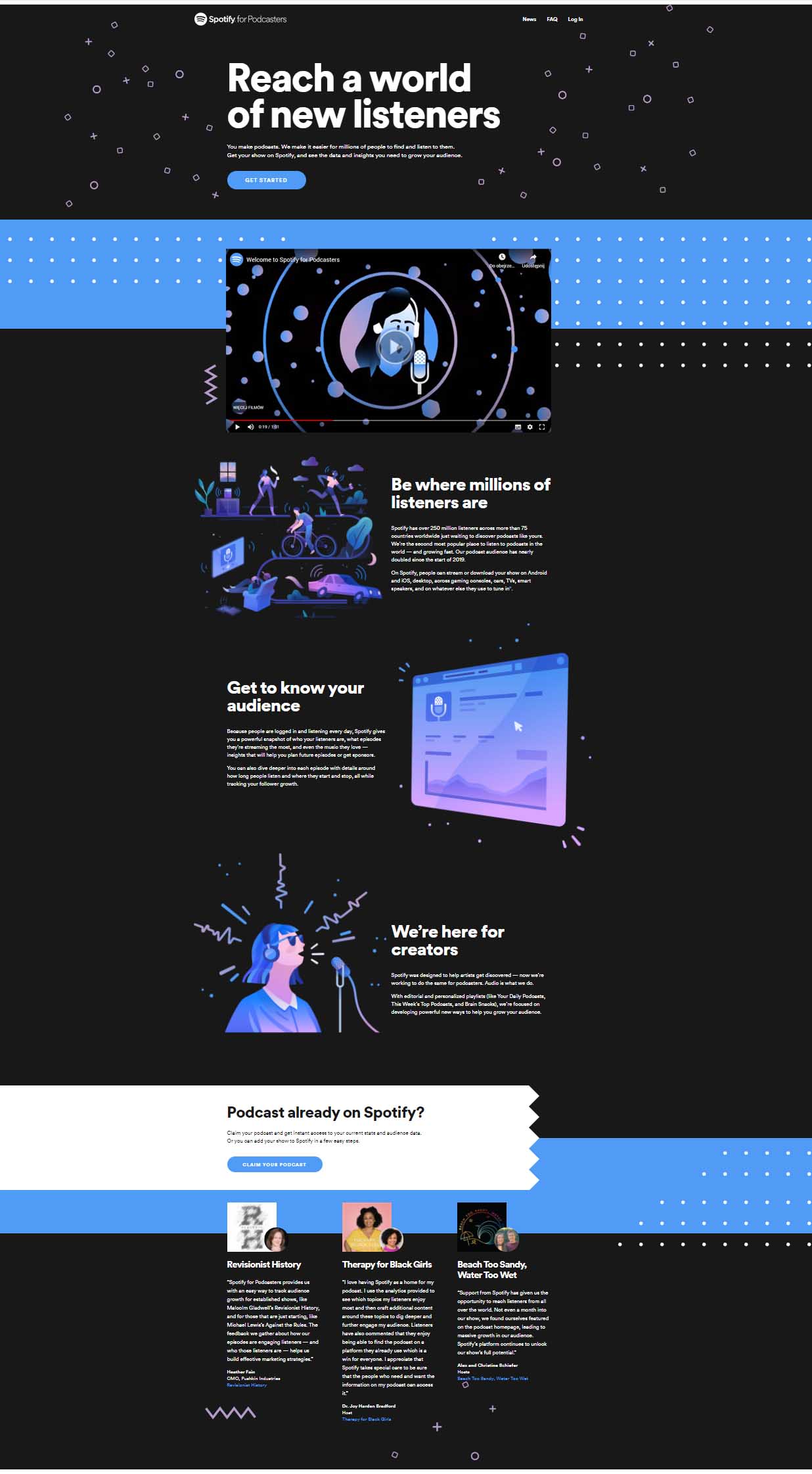
A landing page is a dedicated web page designed to prompt the user to take a specific action—for example, filling out a form, registering, leaving an email address or other contact details for follow-up, purchasing a particular financial product/course, or indicating interest in that product/course, etc.
If that definition doesn’t say much, don’t worry—you’ve almost certainly encountered one and you know how a typical landing page works. Imagine you see an ad on Facebook for a course that interests you. You click it and are taken to the seller’s site. It turns out this isn’t the training provider’s homepage but a page devoted solely to that one course that caught your eye. There you can find a course description, location, dates, promo videos, information about the provider, contact details, and so on. You can also click an active button that takes you straight to the purchase page. That is a landing page—the page you “land” on when a specific product grabs your attention.
Keep in mind, however, that a product page in e-commerce is not the same thing as a landing page. A landing page is a separate space dedicated to a specific sales element.
Product landing page in an online store
Landing pages are very often used in online stores—and for good reason, as they’re one of the simplest yet most effective strategies. They direct the user’s attention to a specific product, let them obtain information about it directly without searching and clicking through multiple categories, and also enable an almost immediate purchase.
It’s worth ensuring that every product in the store is well described and that its dedicated page is clear, intuitive, and contains all the elements of an effective landing page mentioned earlier. A well-prepared product landing page with unique, detailed product descriptions is a win–win: the customer saves a lot of time, and the store earns more because such pages are found much more often in Google.
A landing page can also be used to collect the email addresses of potential customers so you can later send newsletters about discount codes, markdowns, or other promotional campaigns. In such a case, remember that no one will provide their data “for free.” The store must offer something in return—for example, an interesting ebook, a discount code for the first purchase, or free delivery. A landing page is especially useful in various kinds of advertising—e.g., Google Ads or Facebook Ads—when you want to present a specific product and need the ad to take the customer directly to that product or a defined group of products.

Landing page in affiliate marketing
Affiliation is focused on delivering specific results, so a well-prepared landing page is a fundamental tool that helps deliver those results. An optimized landing page is crucial to whether the visitor achieves the intended goals upon arriving there. If it doesn’t encourage the user to take the desired action, the publishers’ entire effort is, plainly speaking, wasted.
This type of landing page works best in campaigns aimed at lead generation, i.e., settled in the Cost Per Lead model. In this model, the publisher is paid for delivering a specific action carried out by customers they referred to that landing page:
-
completing a survey
-
leaving contact details
-
signing up for a newsletter, webinar, or training
-
downloading an ebook
-
purchasing a training course or online course
-
applying for a loan or credit
-
signing up for a test drive
-
and many other actions tailored to the advertiser’s needs.
Landing page — best practices

How to create an effective landing page — 10 elements to remember
The effectiveness of landing pages is undeniable; however, to truly achieve results that satisfy you, you must take care in how they’re built. Every such page should include specific elements that allow users to navigate and act with ease. Communication needs to be consistent and engaging so that not-yet-convinced visitors decide to take the desired action.
1. Create a concise, compelling headline for your landing page
The headline is the introduction to your offer. So take time to craft the right copy—one that conveys a promise to the user, is written in benefit-focused language, and is short. Aim to keep the headline to 5–6 words. A good headline should set you apart from the competition by stating plainly why the customer should choose your offer. This is the so-called USP—Unique Selling Proposition. Don’t present a product feature; think about what it changes in the customer’s life—what it protects them from, how it helps them. Spark the desire to own the product, but remember to make realistic promises. A good practice is to pair the headline with a call to action.
Example: if your target group is affluent, ambitious men with an active lifestyle and you’re selling athletic footwear, include the key benefit in the headline. Instead of repeating slogans (“exceptional, top-quality footwear at an attractive price”), speak in the language of benefits for this specific customer, e.g., “Want to run like a marathoner? Order athletic shoes for demanding men.”
Tip: The secret lies in knowing your target group’s needs and selecting the right publishers. To do this, create a persona—a profile of your ideal customer. If you imagine a real, flesh-and-blood person you need to convince to buy, you’ll handle crafting a persuasive landing-page headline.
A tool that makes it easy to create a persona is Personapp.
2. Use landing pages for special occasions
Create contextual landing pages prepared for holidays and special occasions, aligned with your type of offer. webePartners advertisers often launch partner programs with holiday-focused offers or tied to days off—the May long weekend, vacations, or winter break. They know their customers are looking for special deals then and serve up products on a platter, making it easier to browse the online store.
Example: if you run an online lingerie shop, prepare special landing pages for Valentine’s Day or International Women’s Day, consistent with publishers’ ad creatives.
3. Translate product features into benefits with concise messages
Don’t overwhelm the customer with a mass of details, specs, and facts about the product—they can’t process it. The customer usually doesn’t even know the basics of your offer. They care only about what they will get out of it. Your task is to clearly communicate the benefit that matters most to them. How to do that? Use the feature–advantage–benefit model. List the key feature of a given product, then describe the advantage that follows from it, and finally state the benefit for the customer. Thanks to this simple shift, you’ll sell more in your partner program.
Example:
Feature: a tent made of waterproof PE material.
Advantage: it doesn’t soak through and is durable.
Benefit: you rest after a full day of hiking, regardless of the weather.
A few words about the service at the top and a few sentences below are enough. What you write matters more than how much you write. Include only the most important points. Video formats, infographics, animations, and photos also work well—they can replace text so the user understands what you expect from them with minimal effort.
4. Ensure an interesting and engaging design on every landing page
A visually appealing landing page attracts customers. They will not only stay longer to learn about the product, but will also be more willing to use it if you take care of their aesthetic experience.
5. Always remember the Call to Action
The most important thing is that, across the entire landing page, the calls to action have the same character—that is, they urge a single action, e.g., making a purchase or leaving contact details. Buttons that lead directly to purchase, forms for entering an email address (if that is the goal), and a simple path from the landing page to checkout are so-called user-friendly elements—features that make it easy for visitors to navigate the site quickly and complete transactions.
There should be only one “call to action” button. This makes it easier for the user to make a decision. Make sure it is clearly visible on the page. A larger size and a contrasting color will make it stand out. The user should feel as if the button almost pops out of the background—raised and easy to click. The text on the button should be short, concise, and to the point. The user should know immediately what will happen after clicking it. Address the user directly—replace “downloading (…)” with “download (…).” Finally, check that the button is linked correctly.
Examples of simple messages: replace the vague “click” or the mysterious “discover the magic of the sale” with “Order the book.”
Where should you place the call to action on a landing page? Much depends on the overall graphic design. However, there is a simple rule: the eye travels from left to right. Therefore, a button placed on the right side usually has a better chance of converting.
6. Add “social proof,” i.e., reviews from satisfied customers
An effective tactic is to add various types of recommendations, reviews, and ratings from users who already own your product. Nothing builds trust like a good recommendation.
People look to others for confirmation that your product is worth buying. So include short customer testimonials on the landing page. Make sure each review is specific and highlights the most important benefits of using the product.
Example of a persuasive testimonial:
Bio Natura Cream is my favorite. I spent a long time looking for a lightweight cream with natural ingredients. This one has a simple formula, hydrates beautifully, and doesn’t leave a greasy film. Since I’ve been using it, my skin has stopped acting up. I recommend it to everyone with dry skin.
— Wioletta Pawlik, Beauty Girl Make Up Blog
Tip: The most credible reviews include the customer’s first and last name, a headshot, and a link to their site. Of course, this depends on the type of assortment you sell and the kinds of customers you serve.
7. Attractive photos of products and services are essential to spark interest
Ideally, use images that show the product in everyday use and appeal to emotions. This immediately shows what the purchase changes in the customer’s life and which need it fulfills. Feel free to engage the imagination.
Example: if you sell pet accessories such as a frisbee, show in the visuals how the product enriches not only the pet’s life but also brings joy to family fun (instead of mere product shots: a dog retrieving a frisbee in the park, with a happy, engaged family or competition participants in the background—justify the choice by the targets of the affiliate campaign).
8. Ensure a clear text structure
Internet users don’t want to read dense blocks of text. They want to quickly learn what’s here and what they’ll get out of it. With a few tricks, you can handle visitors’ attention deficit on your landing page. Remember: users don’t read pages—they scan them. And they do it really fast! Did you know that after just 50 milliseconds we judge whether it’s worth staying on a page? Conversion will be helped by:
-
hierarchy of elements
-
bullet points
-
bolding
-
text column width of 400–600 px
-
a clear image gallery
-
use of white space (text “likes” empty, white areas)
-
short, simple sentences (simple statements, present tense, direct address to the user)
9. RWD — the mobile version of your landing page is a must-have
Adapt your landing page for mobile devices, which are a source of valuable traffic. Consider how your customers use mobile sites—on what devices do they browse? When do they do it? For how long? Customers don’t want to scroll through the entire page to learn about the offer. That’s why the mobile view should be shorter and more condensed.
Check how to adapt a landing page for mobile.
10. Test, test, test!
The conversion of your partner program depends on how you test your landing page. So don’t skimp on testing. The most popular approach is simple A/B tests, which let you compare several versions of a landing page and choose the best-converting one. Compare pages that differ by only one element—this makes it easier to spot differences. Multivariate tests work on the same principle but examine many more differing elements on the page—testing every possible combination. They require high traffic. For smaller sites, traditional A/B tests are usually sufficient.
Tip: test the elements that have the greatest impact on landing-page conversion—the call-to-action button, headlines, and page design (including images).
If you want to use ready-made tools to build a landing page, we recommend a few simple builders:
-
Landingi
-
GetResponse
-
Landing Hero
-
Instapage
-
Wishpond
How does a landing page differ from a company’s main website?
A landing page is not the company’s main website, which serves as a business card. Nor is it an online store. A landing page is a dedicated space containing information about a single product or service.
Landing page, i.e., a one-page
A company’s main website is divided into various tabs, categories, and sections. A landing page, on the other hand, is a one-page site—meaning it consists of just a single page. It doesn’t have an extensive menu, lots of varied content, or any additional functionalities.
Landing page, i.e., a single, clearly defined goal
The goals of a company’s main website differ somewhat from those behind creating landing pages. For a website, the main tasks are to:
-
present the brand and build its awareness among customers
-
provide essential information to customers (e.g., about the company, how it operates, return and complaint procedures, deliveries, current opening hours, etc.)
-
communicate with customers
-
acquire new customers
-
allow browsing of available products in the online store with the option to make purchases
Landing page, i.e., a precisely defined target group
The target audience for a company’s homepage includes all regular customers as well as new users interested in the industry. In the case of a landing page, the group is much more narrowly defined, as it concerns only people who may be interested in a specific product or service. Thanks to this, the entire communication process can be more precise.
Landing page, i.e., concise messaging and a Call to Action
The content on a company’s main website differs significantly from that on a landing page. Messages on landing pages are more concise and focused on achieving a specific goal. They address only one issue and are usually concluded (and sometimes interrupted multiple times) with a Call to Action, prompting the desired behavior—for example: buy now, leave your email address, proceed to select a service, etc.
Landing page vs. company homepage — similarities
The homepage and a landing page also share several aspects worth remembering. These are:
-
good optimization (site speed, SEO-friendly content, easy navigation, etc.)
-
high quality of the page’s visual elements
-
the presence of CTAs
-
prominent contact information
-
goals (even if achieved a bit differently)
-
continuously measured statistics
Is it worth using landing pages in marketing activities?
Absolutely! A landing page can generate huge conversions and sales, which is why creating them today is an absolute must-have for any service business or online store. However, remember that it’s better to invest in building one specific, well-polished landing page than ten that won’t function properly. You should also keep in mind that it will take some time before you learn to create a good landing page. You’ll need to learn how to build target audiences, understand consumer behavior, and tailor your messages accordingly.
Most importantly, every landing page should have a panel that tracks its statistics. You can connect it to Google Analytics or any other online analytics service. If you use plugins to build landing pages, they usually come with their own analytics as well. The numbers collected in such panels will let you analyze what went according to plan and which landing page didn’t generate the expected sales.


