Call To Action! Is it still effective?
A Call to Action is one of the most important elements of a website. It’s a prompt that encourages users to take a specific step: sign up for a newsletter, read a particular article, or buy something. Today we’ll show you how to use a CTA effectively.
What is a Call to Action?
A Call to Action (CTA) is an essential part of marketing. It is a necessary component of every website. Regardless of a site’s purpose, the Call to Action button always plays a key role — it encourages a customer or user to perform a specific action. A properly designed prompt can increase interest, sales, or website traffic. If there is no clear CTA, the user’s next step may be unclear. That’s why you need the right message (button) to lead them to the goal.
Where and how to place a Call to Action button
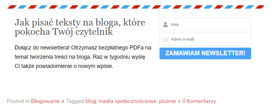
A good CTA should rely on strong, action-oriented language. The most common CTAs include: Check it out! Try for free! Buy now! Sign up for the newsletter and grab a discount! However, we recommend going beyond the usual patterns and tailoring your CTA to the content of your blog or website. / Call to Action — a few tips:
-
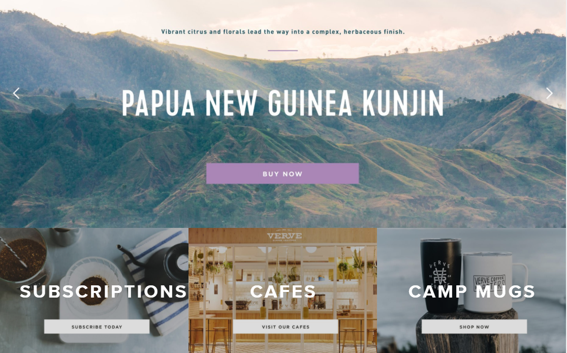
The button/icon must be easy to spot and should attract attention. Don’t forget the visual design and matching it to your website.
-
Placement matters — the CTA should be above the fold of the mailing/content, because recipients devote about 80% of their attention to that area.
-
To increase clicks, you can place the CTA both at the beginning and at the end of the content, as a reminder.
Call to Action — a few tips:
-
The icon must be easy to spot and should attract attention. Don’t forget the visual design and matching it to your website.
-
Placement is crucial — the message should be above the fold of the email/content, because recipients devote about 80% of their attention to that area.
-
To increase the number of clicks, you can place the CTA at both the beginning and the end of the content as a reminder.
-
If you use a CTA as part of the text, emphasize that fragment (so it suggests a hyperlink), increase the font size, and change its color.
-
If you use a CTA as a button, it should contrast with the background and be placed on a bright area free of text, which increases visibility.
-
The button should be an appropriate size to adapt to different device screen sizes.
What makes a CTA effective?
First and foremost, you need to clearly define what you expect the user to do. If you want them to click a button, use messages like: “Click here,” “See details,” or “More.” A very effective approach is to state the benefit the user will gain by taking that action.
To encourage potential customers as much as possible, your Call to Action should be as clear and compelling as possible. That means highlighting the benefits of responding to your prompt. You need to convince the recipient that they’re making the right choice. By signing up for a newsletter, they will receive valuable and useful information; by buying a product through your link, they’ll be making the best possible decision.
There are several ways to win a customer. The first is to add a concise description of the offer’s main benefit. The second is to place an image of the product or the result next to the button. Of course, if possible, it’s worth emphasizing the exclusivity of the offer: “Over 1,000 people have used this offer” or “The promotion ends in 5 hours.”
Test your Call To Action!
Don’t forget to measure how effective your buttons are! A/B tests can help — you can compare several different CTAs and check which ones users click most often and which lead to the highest number of desired actions.
A tool like Omniconvert can also be useful, allowing you to test your CTAs without any specialist knowledge.
Call To Action in affiliate marketing


